Interactive Gameplay Design 008 – Saad, Steven, Michael
Design Document
Interactive Gameplay Design 008 – Saad, Steven, Michael
Design Document
Saad Chaudhry
KC3289
Kingston College
BA Digital Arts
Network Aesthetics
Assignment 2
Website Evaluation
20/01/16
Word Count: 1,098
Website Evaluation
My collaborative networking site would focus on art because it is an area I have some knowledge in. However, it was difficult to pinpoint a central area of art. I researched various art websites e.g. Pinterest, Behance and Dribble, but found they were quite similar in scope and purpose. I was interested in the concept of users showcasing their work and receiving appreciation, interpretations and comments. I wanted this aspect for my site, but needed a groundbreaking difference to stand out.
After a sudden realisation, I was struck with an idea as to how to proceed. A specific online location for community and socially driven artists where users upload work, obtain feedback, but could also collaborate on a storyboard where they would upload illustrations attaching famous quotes and dialogues. Thereby creating a rolling storyboard. This would be a continuing collaboration between creative minds enabling discovery and exploration of others artistic abilities.
I received feedback for my website concept and though it was seen as an interesting idea, the thought process was that by adding the storyboard idea to a site for showcasing work was not in the users’ best interests, as the site was intended for all areas of creativity and not just illustrators. There was also no guarantee how many people would use the storyboard concept, and without the users contributions, this idea would fail. After much thought I also felt the combined use of the website as a showcase for work and creating an on going storyboard was not enough of a hook to attract visitors to my site. Carroll (2014) states:
“carving out a niche area is more effective. The best bloggers focus on specific interests, the narrower the topic, the better. This leverages their own expertise and experience in the area.”
Carroll, B (2014, p.183).
I decided to omit the storyboard idea because keeping this concept would not create an interactive environment for all participants. My website was still going to showcase work, but now it needed another original concept where users with shared interests could socially engage.
A lecture on 7th October 2015 about how Facebook’s membership was initially restricted to university students inspired me on having my website for university students to showcase their work. After some research to see if a social networking site aimed specifically for students would be beneficial to them:
“students often spend a large amount of their free time using social media, so if this tool could be used effectively for academic purposes it would be a great resource.”
I had found my concept for a niche and specialised site where people with common interests could come together. This would become a One Stop Shop for university art students, a place where they could get advice, chat, upload work and find information. The question now was if it would be relevant as a social networking site and if there was any further advantage to students coming together.
Howard Rheingold, a critic, writer and teacher specialising in modern communication media, talks about the “powerful combination of social media and peer learning” (Rheingold, 2015), reinforcing my idea of a powerful purpose behind my niche social networking site where a greater interaction between students from the creative fields provides a greater sense of community spirit.
I also wanted to involve potential employers and enable them to upload their details and register on the site. This would enable them to view work from the next generation of creative minds and maybe find suitable employees. Unfortunately, I had to cancel this idea because after sending a few emails to potential employees, the response though positive, was not so encouraging for the uptake of their using the site. I converted this idea to having a link for graduates to register as mentors, something not quite adopted with other social networking sites.
I finally had a concept and a strong vision for my website. It was going to be a site for art students to converge, interact, provide relevant information and where a sense of belonging to a specific community would enhance learning and consequently allow individuals to increase their social network, as stated by Bargh, McKenna, Helliwell and Putman (2004) “social networking relates to indices of psychological well-being, such as self esteem and satisfaction with life” (p.582).
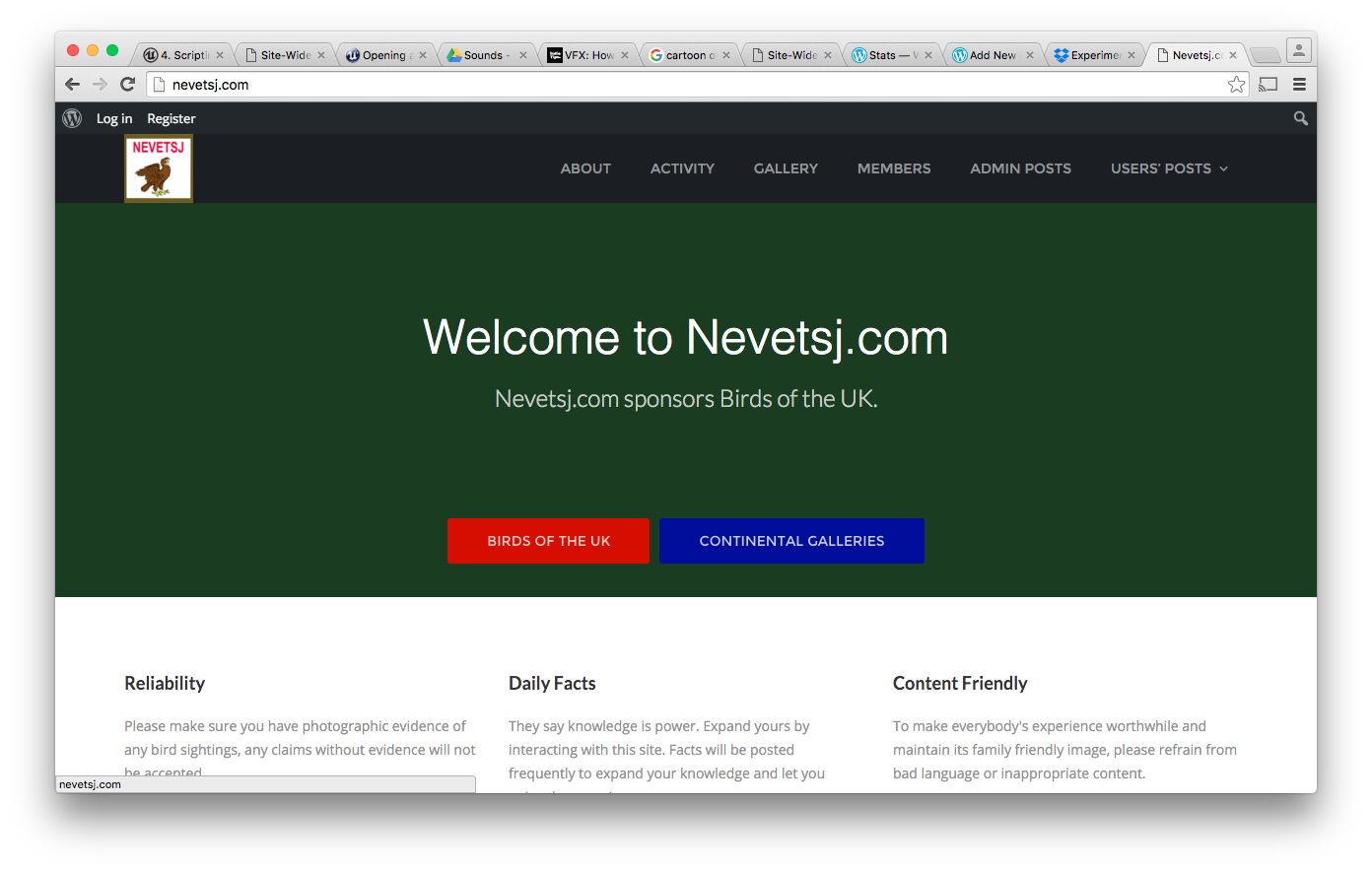
To create the site I bought my domain name (easy enough process), ‘saadchaudhry.co.uk.’ I decided to use WordPress with BuddyPress combined with a number of other plugins. I customised the site to make it more personal and after experimenting chose the Colorways theme. This gave my website a modern but simplistic appeal. I added the plugin ‘ifly chat,’ which allowed users to converse in real time. Other plugins were added to upload media and add friends. Links were added so students could navigate easily to artistically helpful sites. There was a lot of trial and error deciding and experimenting with a variety of plugins to create the site how I had visualised. During this process my mum registered and used the site. This was very successful but unfortunately the day the students tried they kept getting a log in error. It was very frustrating because my dad had registered the day before to test the site and it had worked fine. It was thought it was a technical glitch. I contacted the students but in the meantime had other family members register and use the site the same evening. Success, and my social networking site had started to take shape.
The ‘ifly’ chat was successful because after people had registered to my site they were able to converse. The plugins were used successfully and my site now has a variety of media uploaded and comments attached. The links to useful sites also worked well. I wanted a link for graduates to register as mentors but was not able to make this workable. Throughout this process I have learnt to visualise what others might want, rather than just what I would want to see on my website. I had to put myself in the shoes of the user as well as the administrator. This was hard at times because I didn’t always want to do so much research, favouring the easier option(s), but I soon realised the importance of my role as administrator and web owner, where I tried to make my website with the audience in mind, envisioning the interests and expectations of my users. If I had more time I would add much more information to the site and also make it look more aesthetically pleasing and user friendly.
Bibliography
Bargh, J., & McKenna, K. (2004). The Internet and social life. Annual Review of Psychology, 55(1), 573–590.
Carroll, B (2014) Writing and editing for digital media. New York: Routledge
Tella, A (2015) Social Media Strategies for Dynamic Library Service Development. USA: IGI Global
Rheingold, H (2015) Peeragogy Handbook. Chicago: Pub Dom Ed Press


This week we continued with working on our websites and presenting our sites to the other students so they could register and show some activity on the sites. Most of the students sites worked fine but there were a few hiccups. I had a major hiccup. No one could register on my site because after entering their details the site kept rerouting them to the log in pages and they would have to wait 20 minutes to renter the site. So annoying but matt said these technical faults to happen. He told the students to try when they get home because by that time the site should start working. I also facebooked them as a reminder when I got home.
We were given further advice about Assignment 2 and it was clarified what was expected for the essay and for next week where we would have to have at least four people registering on our websites and using them.
I was also given feedback for my website. Matt liked my images and helped me with some ideas for frontend submissions links.
We continued working on our websites.
Matt was not here again so again continued with improving my website and the other modules projects.
We were told that Matt would not be here today so continued working on the website and the other module projects.
Website feedback
It was feedback day for our website presentation. Matt told me that I had a good strong presentation. It was well structured with a clear purpose. It was also easy to follow. The use of font and big titles was also good. Matt liked the academic research I had shown to support my website idea. Matt felt I had a strong concept. I had also shown some technical information, which was liked. The questions from the audience also showed they were interested and I was told I answered them well.
On the negative side I had too much information and needed to condense the contents on each slide. Having more bullet points would have been better. The presentation also needed to be paced better so the audience would remain engaged.
Matt felt I would be getting marks in the 60+ range and maybe higher once the final marks were verified. I was very pleased with this as I really struggle with presentations because of my speech and hearing impairment.
Haris gave me a tutorial to create the main menu and activate the level. Followed the tutorial but main menu would not activate the level.
This is the tutorial I followed to create the main menu. I created the image in photoshop and then followed the tutorial.

Here is the blueprint for my menu.


This did not start the level. The screen remained on the main menu when I pressed the start button but the quit button worked. This is another tutorial I followed to see if I could get the start button to work.


This does not work.
https://docs.unrealengine.com/latest/INT/Engine/UMG/QuickStart/4/index.html
This is the documents I followed to try and activate the main menu.
Googled to see if anyone has ever had the same problem and found this. I have already worked on trying to get the main menu to work for about 6 hours over the week. The assignment deadline is coming up but will try and give it another go if I can find the time whilst completing the other assignments.
